How to Wear Bold Prints and Colour Without Overthinking It
A little colour can change the feel of an outfit. Here’s how I’d build up to bold prints, mix shades and find combinations that feel like you.
By Rachel Branson · 6 November 2026
Bold prints can look wonderfully effortless on someone else and oddly daunting when you’re standing in front of your own wardrobe. Is the pattern too much? Do the shoes need to match? And what happens when you add a bright bag?
My starting point is simple: an outfit doesn’t need to be quiet to be easy to wear. It just needs a bit of connection between the pieces — and to feel comfortable enough that you can forget about it once you leave the house.
Here’s how I’d approach colour and print, whether you’re dipping in a toe or ready for the whole paintbox.
Start with one piece you genuinely love
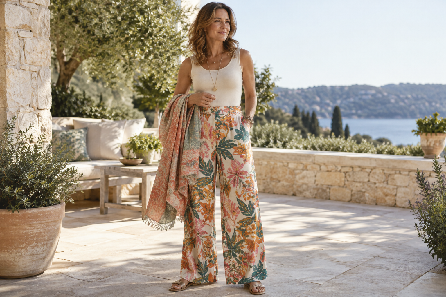
Rather than deciding you need to become ‘a colourful dresser’, choose one piece that catches your eye. It might be a patterned scarf, a bright shirt or a pair of printed palazzo trousers.
Build around that piece using clothes you already reach for. If your usual outfit is jeans and a white shirt, a colourful wrap is a very small change. You haven’t suddenly acquired an entirely different wardrobe; you’ve given a familiar outfit a lift.
Try these starting points:
- A bold printed wrap over a plain T-shirt and jeans.
- Patterned trousers with a simple shirt and flat sandals.
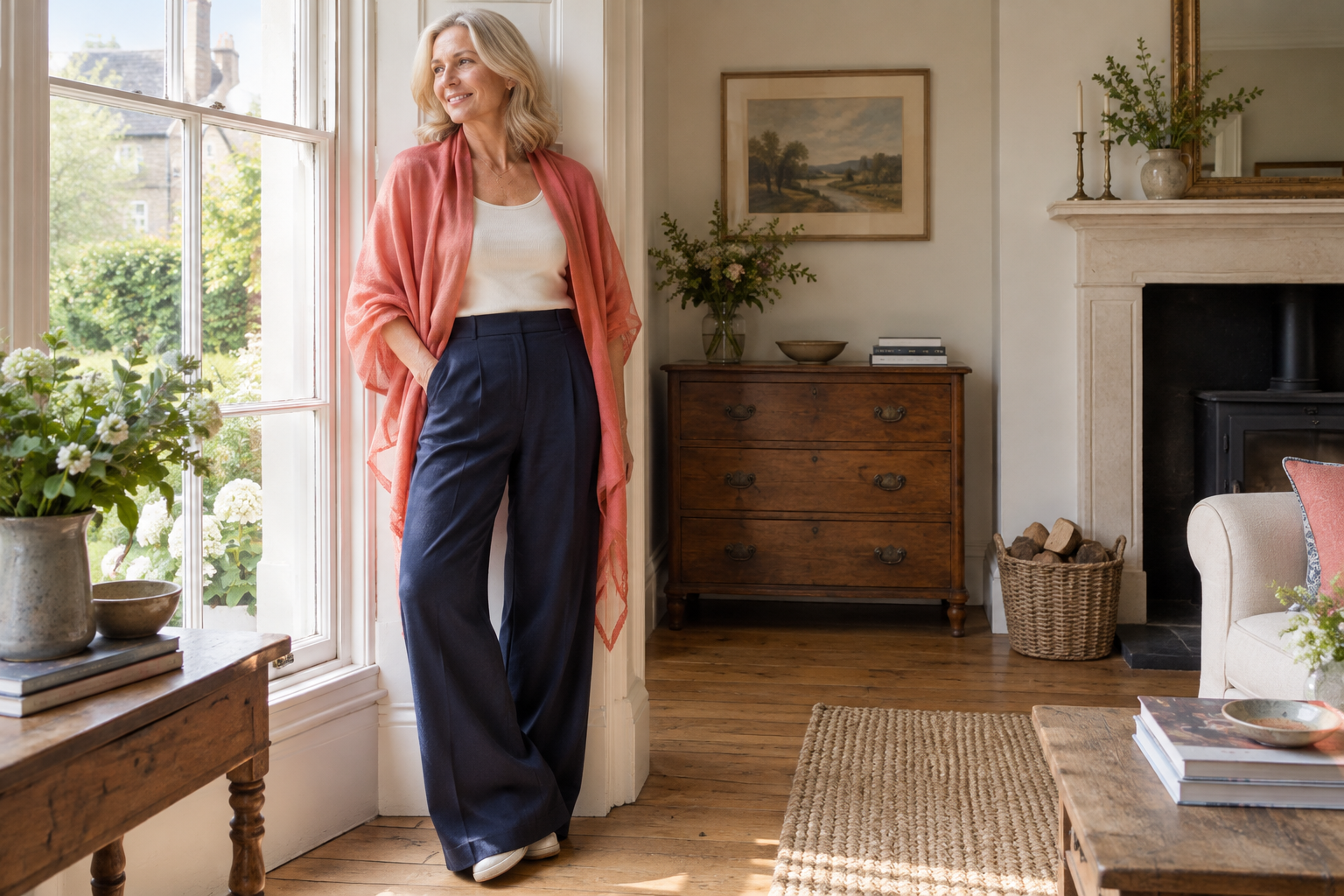
- A bright top with your favourite neutral trousers.
- A short printed kimono over a plain vest and straight-leg jeans.
The familiar pieces do some of the settling-in for you.
Pull one colour out of the print
If you’re unsure what to wear with a pattern, look closely at it. There’s often a smaller, quieter colour tucked between the more obvious ones. That can be your link to the rest of the outfit.
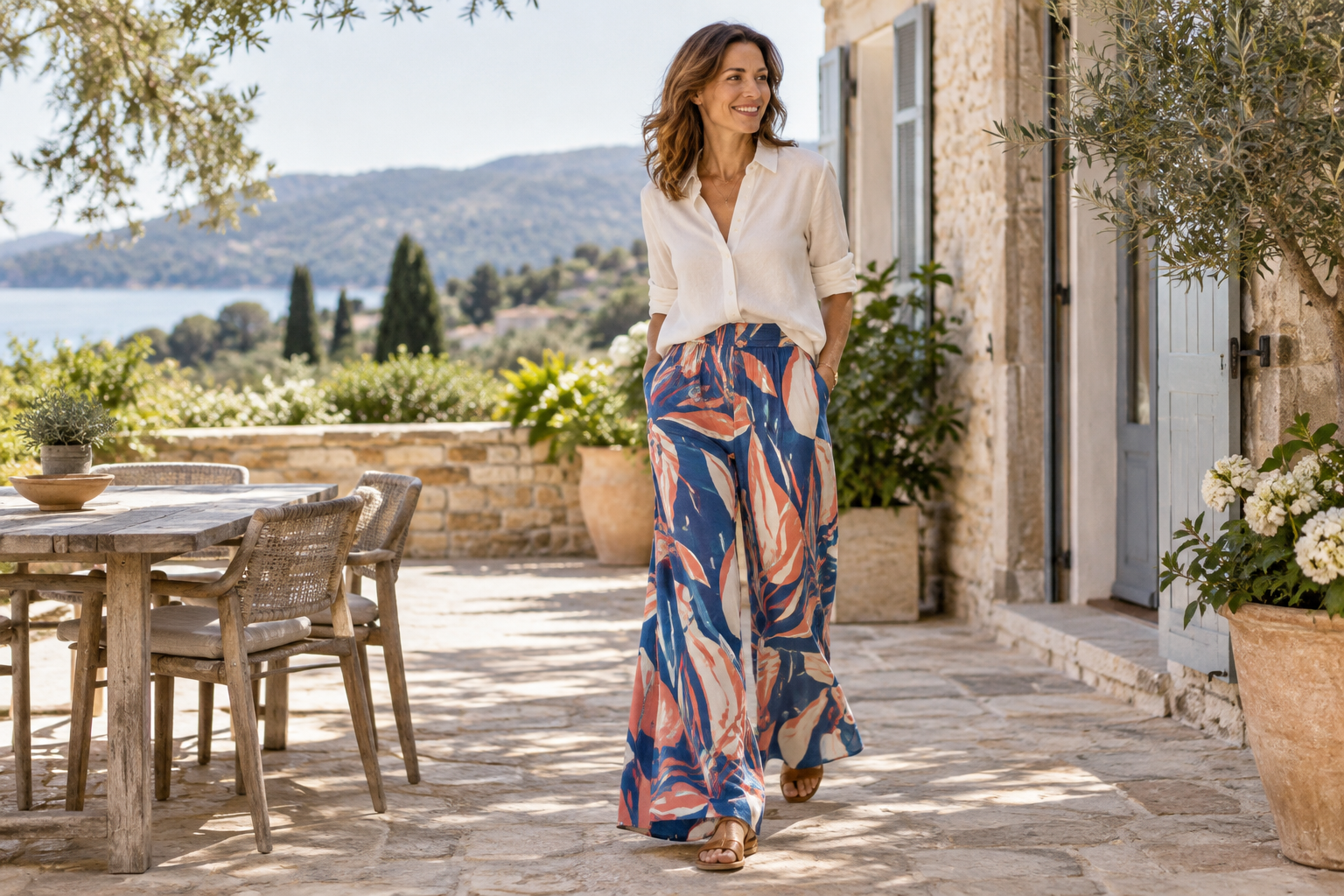
Imagine trousers with a cobalt, coral and cream print. A cream shirt gives you a softer combination; a cobalt top makes it more saturated. Coral sandals could pick up the warm detail without adding another large block of colour.
You don’t need an exact match. Similar shades can sit happily together, especially when they’re separated by a little space. A blue earring doesn’t have to be the identical blue in your trouser print.
I’d usually start with one colour connection rather than trying to repeat every shade. It gives the outfit a thread without making it feel painstakingly coordinated.
Choose a neutral that suits the mood
Black isn’t the only way to ground a bright print. Sometimes it creates a sharper contrast than you actually want.
Try holding the printed piece beside a few different basics in daylight:
- Ivory or cream can soften vivid pink, turquoise and orange.
- Navy offers a gentler dark backdrop for many blues and reds.
- Tan or chocolate can bring warmth to green, coral and yellow.
- Grey can make a bright shade feel a little cooler.
- Denim gives many bold prints an everyday, informal feel.
These aren’t fixed pairings. The particular shade matters, so use what’s in your wardrobe as a testing kit. Lay two options beside the print and notice which combination you’d actually enjoy wearing.
Think about where you want the colour
You don’t have to wear your brightest shade next to your face. If you love orange but don’t love it in a blouse, try orange trousers, a bag or a print with orange running through it.
Equally, a colourful neckline might be exactly what makes a plain outfit feel right. Hold the fabric up in natural light and see whether you like its effect beside your face. You don’t need to assign yourself a colour ‘season’ before trusting that response.
A reversible wrap is useful here because it lets you change how much print is visible. With an AK wrap that’s printed on one side and plain on the other, you can fold back an edge to show a narrow strip of pattern, or turn the print out fully. You can explore the wraps with that flexibility in mind.
Balance the shapes, not your body
There’s no rule that bold prints belong on certain body types. I find it more useful to think about how the clothes sit together.
With flowing palazzo trousers, a shorter top or a small front tuck can make the waistband visible and give the outfit a clear shape. If you prefer a loose shirt, try wearing it open over a vest, or choose one with side splits so it moves rather than bunches.
A short kimono works easily over a simple base because you can see the outline of the outfit underneath. That base doesn’t have to be tight — just comfortable and not competing with several other bulky layers.
Before deciding, sit down, walk about and lift your arms. A beautiful combination isn’t much use if you spend the day rearranging it.
Mix prints with one point of connection
Print mixing is optional, not an advanced exam you need to pass. But if you fancy trying it, give the patterns something in common.
The easiest connection is colour. A navy-and-white stripe can work beside a floral that includes navy, even though the designs are quite different.
Then look at scale. A small, closely spaced pattern often provides a useful contrast to a larger, more open one. Two equally large, busy prints can compete, although that might be precisely the effect you enjoy.
For a straightforward first attempt:
- Choose one print as the main feature.
- Add a second print in a smaller area, such as a scarf or bag.
- Repeat one colour between them.
- Keep the remaining pieces plain while you assess the combination.
Take a quick mirror photograph if you’re unsure. Seeing the whole outfit at once can be more helpful than studying each piece separately.
Let shoes and accessories set the tone
The same printed trousers can feel quite different with trainers, flat sandals or a neat evening shoe. Before adding accessories, decide what the outfit needs to do: a busy day out, lunch, a relaxed evening?
For daytime, I’d start with practical footwear and a bag that holds what I need. There’s no benefit in a beautifully coordinated bag that won’t fit your essentials.
You can keep accessories quiet, but you don’t have to. A bright bag can work as a deliberate second colour. Try repeating it once in a small detail, or letting it stand alone against an otherwise simple outfit.
If something feels fussy, remove one element and look again. It may be the necklace or belt, rather than the print, that’s making the combination feel crowded.
Keep a few easy outfit formulas
Having a reliable combination saves a lot of morning debate. These are three I’d use as starting points, adapting the colours to whatever you already own.
Printed trousers + plain top + simple shoes. With AK wide-leg trousers, I’d choose a top in one of the print colours, then check the hem with the actual shoes I plan to wear. It should clear the ground rather than catch beneath my heel.
Plain outfit + colourful wrap. A navy or cream base leaves room for a vivid print. Fold the wrap more narrowly for less coverage, or drape it broadly when you want both colour and an extra layer.
Bright trousers + printed short kimono + plain vest. Choose one shared colour between the trousers and kimono, then let the vest provide a little visual breathing space.
Give yourself time to get used to it
Sometimes an outfit feels ‘too bright’ simply because it’s brighter than your usual clothes. Wear it around the house for a few minutes before dismissing it. Check it in daylight, move about, and ask whether you feel comfortable — not whether it looks like something you’ve worn before.
You can always turn the volume down: swap a bright top for cream, show the plain side of a wrap, or change a patterned bag for a simple one.
The aim isn’t to wear the most colour possible. It’s to find combinations that make getting dressed feel enjoyable. One lively detail counts just as much as a joyful head-to-toe print.
Rachel Branson
Designer and founder of Art Katsura. I travel often, review hotels and retreats, and design colourful reversible pieces made for a life well travelled.